
Have you ever visited your nonprofit’s website and been left with a sinking feeling that it’s not measuring up? Its design seems outdated and clunky, and all of your passion and good work doesn’t shine through.
But a website redesign doesn’t feel urgent with everything else you have on your plate.
You wouldn’t even know where to start if it did feel urgent, much less when in the world you would find time for it.
Totally understandable.
You need a simple way to cut through all of the online noise about website design and just get started.
I’m going to share a few traits that the best nonprofit websites have in common, followed by some examples for you to check out.
My hope is that it helps kick your creative juices into gear and clarify a direction for you to pursue as you work toward your best website ever.
YOU CAN DO THIS.
The best nonprofit websites have several things in common:
a long-scrolling template. This requires minimal navigation on the visitor’s part and is compatible with the way people interact on mobile devices. (Scrolling over clicking!)
concise copy. Boil your mission and your projects down to the key basics and say those in a memorable way.
full-screen graphics that feature real people. This personalizes your work and creates a connection between your visitors and that work.
a bold call-to-action and an easy way to donate. What do you want visitors to do? Don’t make them guess. Put that button front and center!
a few facts to convey the scope of the problem and/or the impact of the nonprofit. Share these with an infographic for maximum impact.
a compelling story. This can be the story of someone negatively affected by the problem you’re trying to solve or a testimonial of someone positively impacted by your work.
an opportunity to learn more by clicking through to other pages on your website. Feature buttons that link to your blog and other resources. Visitors need to know that YOU are the go-to expert for your cause.
an attractive color scheme, easy to read font, and sleek logo.
These 5 successful nonprofit sites make it look easy (click on the pic to see the full site):

Charity: Water
Charity: Water consistently ranks high in website design, and it’s easy to see why.
They are clear about their mission: “We believe in a world where every single person drinks clean water.”
They put their CTA front and center - and it’s bold. They ask for a monthly gift right off the bat.
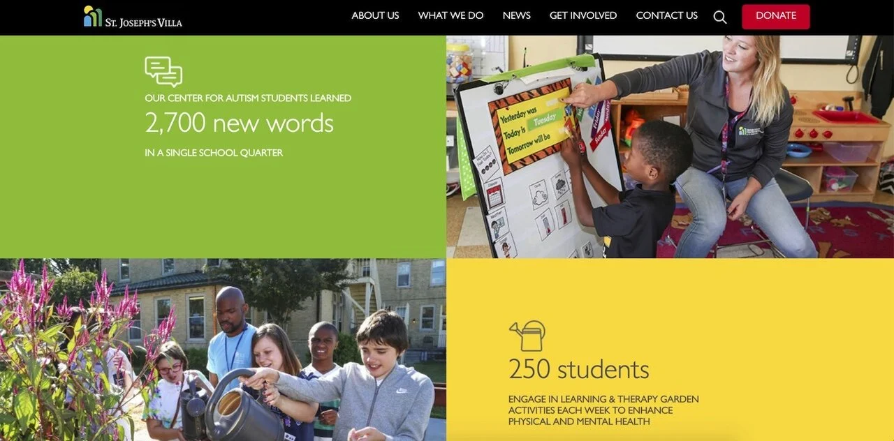
St. Joseph’s Villa
St. Joseph’s Villa is a local nonprofit in Virginia that provides a broad range of services. It could be easy for them to try to say too much about what they do.
Instead, a short full-screen video plays above-the-fold when you open their page.
As you scroll down, you see 3 high-impact stats highlighting their work.
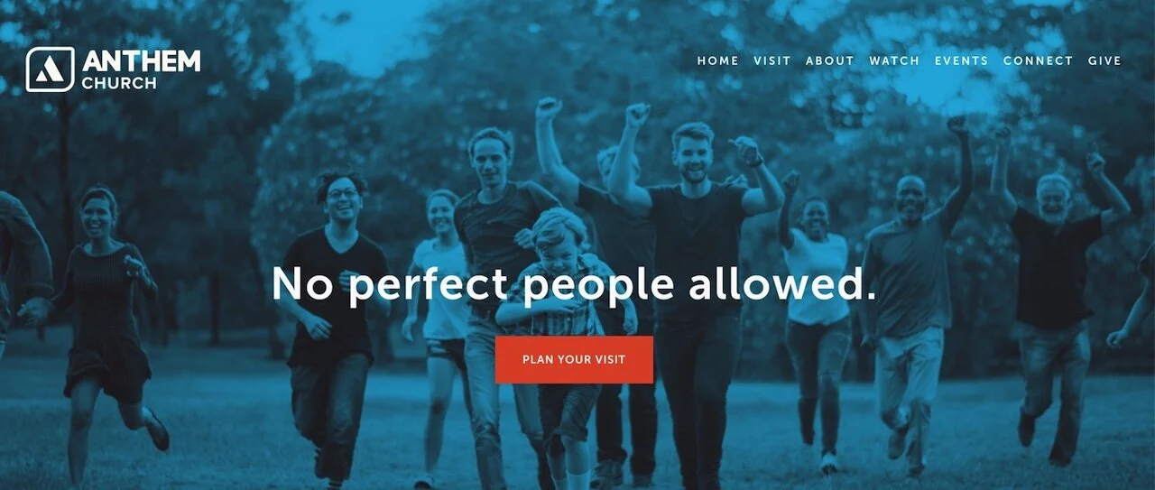
Anthem Church
Anthem Church is a smallish church in Bedford, MA with a beautiful, clean site. It features:
a full-screen pic of smiling people.
a clear message: “No perfect people allowed.”
a bold CTA: “plan your visit.”
If you want to learn more, there are links to do that, but the main page keeps it simple.
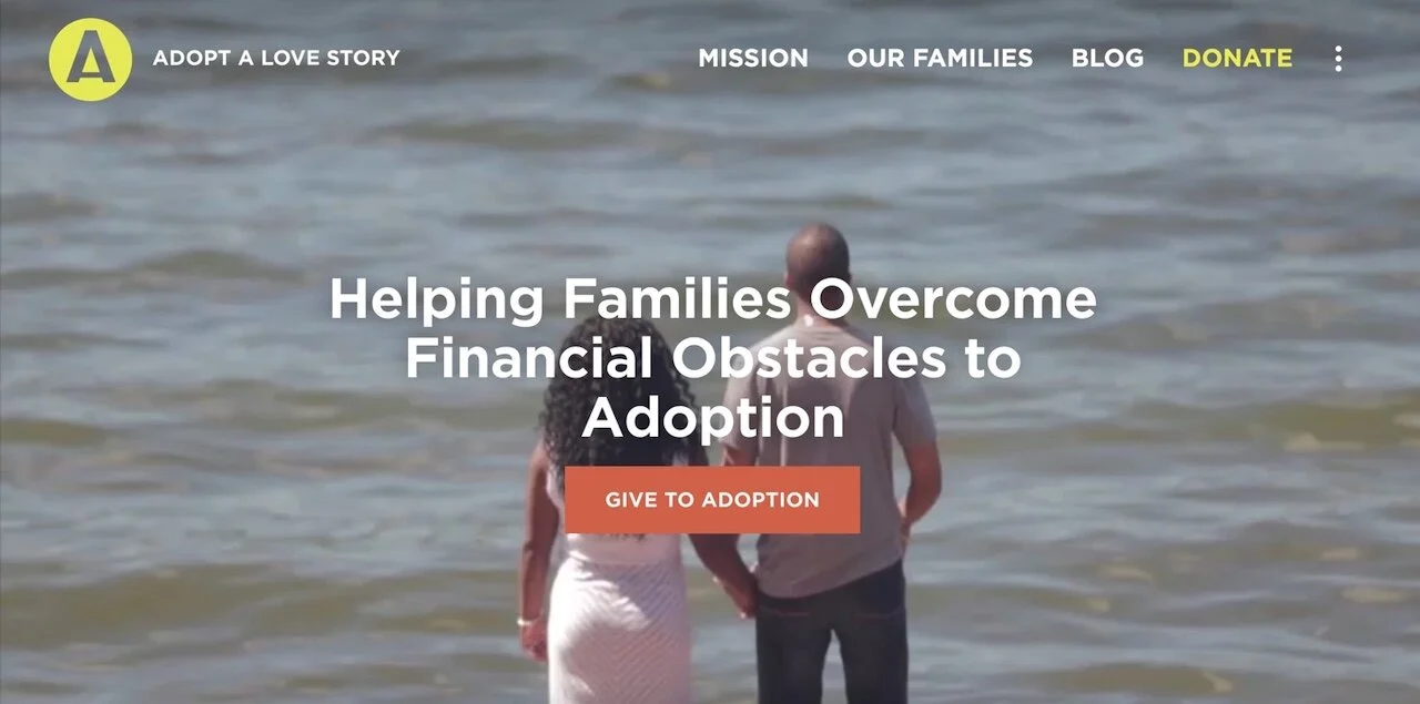
Adopt A Love Story
Adopt a Love Story is a crowdsourcing platform for adoptions.
Every page of their site has several buttons that allow you to either learn more or to donate. People don’t give the first time you ask. Several buttons on each page allows visitors to give at the point you’ve convinced them.
They feature lots of stories of real families trying to adopt.
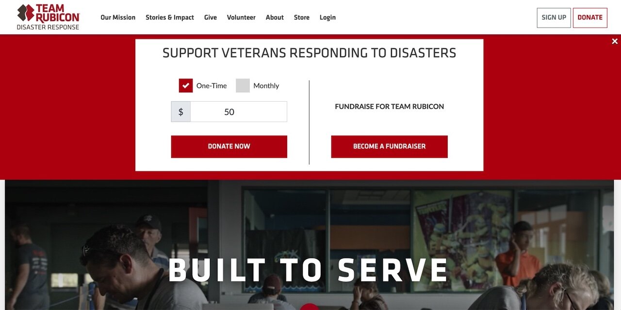
Team Rubicon
Team Rubicon mobilizes U.S. military veterans for disaster relief. Their website:
has a clear CTA and mission statement above the fold.
includes 2 text boxes as you scroll down that state the problem (natural disasters) and the solution (22 million veterans).
makes an excellent use of infographics.
manages to include links to several stories without the page seeming overwhelming.
To sum up what we’ve seen:
large pictures
lots of white space
lots of buttons (for donating and learning more)
infographics
stories of donors, volunteers, or recipients of services
minimal text
Less text on your home page doesn’t mean that text matters less.
Text matters MORE when there’s less of it.
Need website copy that cuts through the noise?
